Objective:
This project aims to create a dynamic and user-friendly Power BI dashboard for an electronic retailer, offering in-depth analysis of sales data and customer behavior.
Goals:
◾ Track key performance metrics (KPIs) and trends for the company.
◾ Empower stakeholders with real-time insights for better decision-making.
◾ Make it as simple and comprehensive as possible so that anyone can understand it.
◾ optimize sales strategies, and enhance overall business performance in the competitive electronic retail market.
Activities:
◾ Data Integration: Connected to various CSV and excel files to gather sales and customer behavior information.
◾ Data Cleaning & Transformation: Used Power Query to Prepare the data by ensuring accuracy and consistency, making it suitable for analysis.
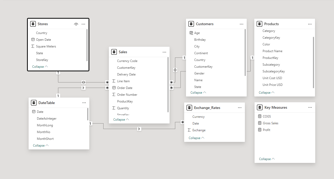
◾ Optimize the model: Make key DAX measurements that allow us to have all the information needed without loading the model as well of a more complex formula to connect the exchange rate. It was also added a date table for avoiding many to many relationships between the exchange table and the sales table.
◾ Dashboard Design: Utilize Figma to make an informative dashboard design able to showcase the most important information for the stake holder.
Key Findings and recommendations:
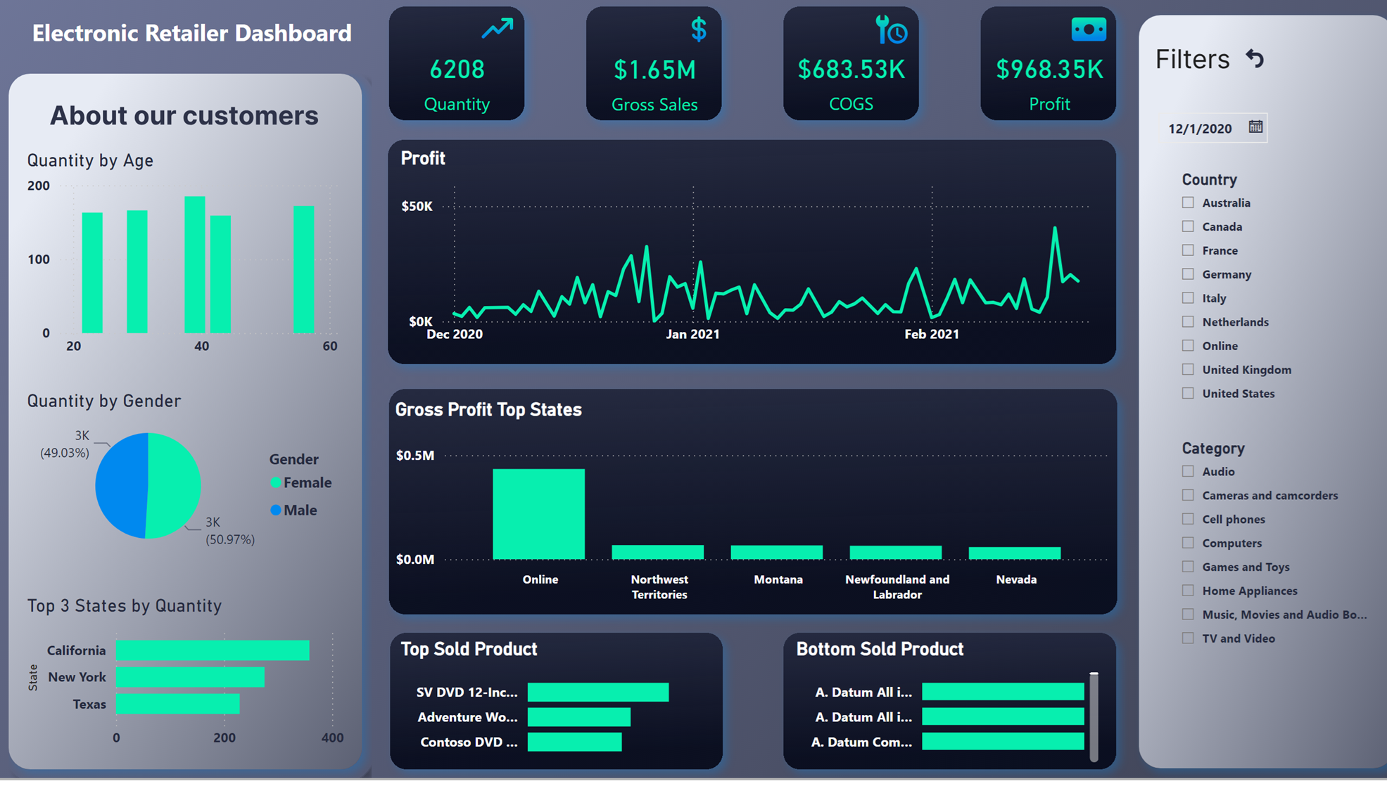
◾ Least sold products: there are quite a few products that were sold only once.
Actions:
- Make an in-depth revision of the products that have been sold only once. Removing these items from the inventory can lead to a cost saving in logistics and/or operational processes.
◾ Profit fluctuation over the year: At first glance, it seems that there is an unusual behavior in the profit trend.
Actions:
- Check if the reason for this fluctuation is seasonal or because of customer dissatisfaction.
◾ Bost Online Sales: As of now, online sales are the most beneficial for the company, leaving almost half of the profit of the year.
Actions:
- Designate resources to strengthen online sales even more.
◾ Customer’s age: Most of the customers range from 23 to 47 years old.
Actions:
- Using this dashboard can accurately show what the niche of the marketing campaign should be. It can be filtered by product, area or even customer’s gender. It is crucial to exploit this feature since it will lead to the correct alignment of the customer’s needs and consequently higher sales.
DAX Formulas used:
COGS =
SUMX(
Sales,Sales[Quantity]*
RELATED(Products[Unit Cost USD])*
LOOKUPVALUE(Exchange_Rates[Exchange],
Exchange_Rates[Date], Sales[Order Date].[Date],
Exchange_Rates[Currency],Sales[Currency Code]
))
Gross Sales =
SUMX(
Sales,Sales[Quantity]*
RELATED(Products[Unit Price USD])*
LOOKUPVALUE(Exchange_Rates[Exchange],
Exchange_Rates[Date], Sales[Order Date].[Date],
Exchange_Rates[Currency],Sales[Currency Code]
))
Profit =
SUMX(
Sales,
Sales[Quantity]*
(RELATED(Products[Unit Price USD]) – RELATED(Products[Unit Cost USD]))*
LOOKUPVALUE(Exchange_Rates[Exchange],
Exchange_Rates[Date], Sales[Order Date].[Date],
Exchange_Rates[Currency],Sales[Currency Code]
))
DateTable =
ADDCOLUMNS (
CALENDAR(MINX(‘Sales’,‘Sales'[Delivery Date]),MAXX(‘Sales’,‘Sales'[Delivery Date])),
“DateAsInteger”, FORMAT ( 2025, “YYYYMMDD” ),
“Year”, YEAR ( 2025 ), “MonthNo”, FORMAT ( 2025, “MM” ),
“YearMonthNo”, FORMAT ( 2025, “YYYY/MM” ),
“YearMonth”, FORMAT ( 2025, “YYYY/mmm” ),
“MonthShort”, FORMAT ( 2025, “mmm” ),
“MonthLong”, FORMAT ( 2025, “mmmm” ),
“WeekNo”, WEEKDAY ( 2025 ),
“WeekDay”, FORMAT ( 2025, “dddd” ),
“WeekDayShort”, FORMAT ( 2025, “ddd” ),
“Quarter”, “Q” & FORMAT ( 2025, “Q” ),
“YearQuarter”, FORMAT ( 2025, “YYYY” ) & “/Q” & FORMAT ( 2025, “Q” ))
Screenshots:

Data Model:
